While map applications such as Google Maps are impressive and efficient, they conceal the pathfinding process from users. To provide greater accessibility and transparency, I decided to create my own version that visualizes the path-finding process.
A dynamic and interactive web application that visualizes the pathfinding process of different algorithms to determine the shortest routes between two London Underground stations.
Duration
Jan 2024 - Feb 2024
Tools
React.js
Disciplines
Web DevelopmentUI/UX Design
Motivation
Enhancing maps with real-time path-finding visualizations
How does it work?
Building a robust system
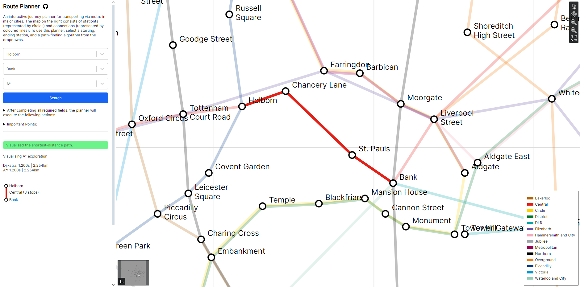
To create a complete metro map, users must provide three .csv files with station names, connections, and metro line names. These files are processed and consolidated into a central data provider. This data can then be queried for:
- populating the metro map with stations and connections.
- finding shortest paths using generated adjacency lists.
- generating visualizations for optimal routes and necessary transits, similar to Google Maps.
Bringing the idea to life
Pathfinding states
With the underlying data structure prepared, users can search for a pair of stations to visualize the shortest distance path and select a specific pathfinding algorithm.
Each connection on the map is represented with one of three color states:
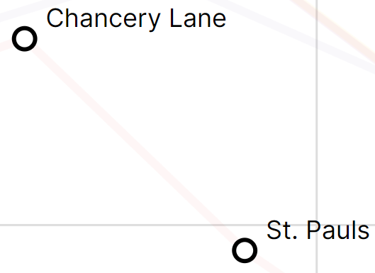
Lightest: Unexplored connection
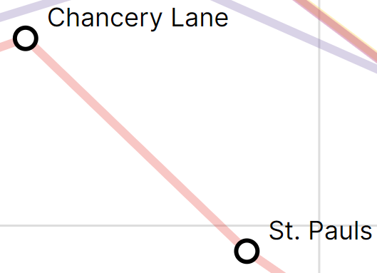
Darker: Explored connection
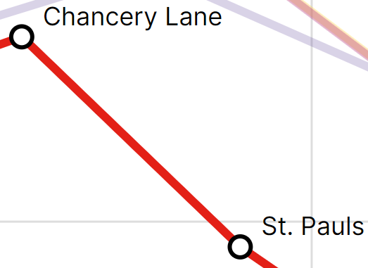
Solid: Selected connection
The system explores the entire map in real-time based on the selected algorithm, visualizing the process. Once the shortest distance route is found, the selected route is displayed in solid color.
Best Practices
I followed SOLID principles and applied design patterns to improve code quality and scalability. Ultimately, this allows me to develop a more efficient, modular and adaptable system.
For details, please refer to the documentation for the application at the github page.
GitHub